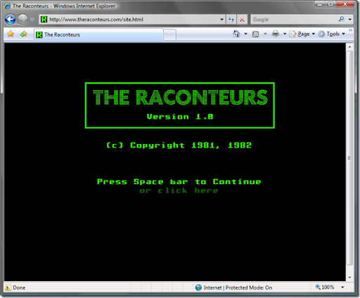
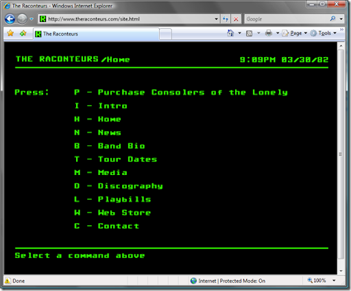
I usually limit myself to things purely technical on this blog, but this was a little cool to pass up and is somewhat technical in nature. The Raconteurs have created their web site using a user interface reminiscent of something circa the early 80's. Looking at the page source, it is done mostly using Macromedia Flash. Disregarding the evil splash page, JavaScript errors, and possible copyright infringements (oh my!), there is truly something wonderful about this minimalist approach. What's the point of being so pretentious when you are only providing basic information? Far too many web sites are bloated with ubiquitous links and ads, and provide for a truly miserable user experience. Needless to say, it would have been way cooler (and no doubt, achievable) if they could have done this using only HTML, JavaScript, and CSS. By the way, if you haven't already, check out the their new album. This is true and unadulterated rock n' roll.
Splash Page
Home Page
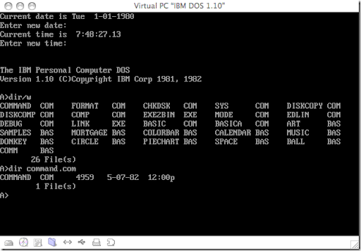
DOS 1.10 - Notice the dates 1981, 1982.


No comments:
Post a Comment